Watch this (negative) space

Ever looked at a logo and went “woah, that is SO clever!”? Quite a few times you will find this is due to the usage of negative space. It’s one of those things that you just can’t unsee and couldn’t possibly imagine the logo looking any other way anymore. Using negative space is a neat little trick to incorporate subtle details that might not be visible at first glance, giving a logo another exciting layer.

The Hideout

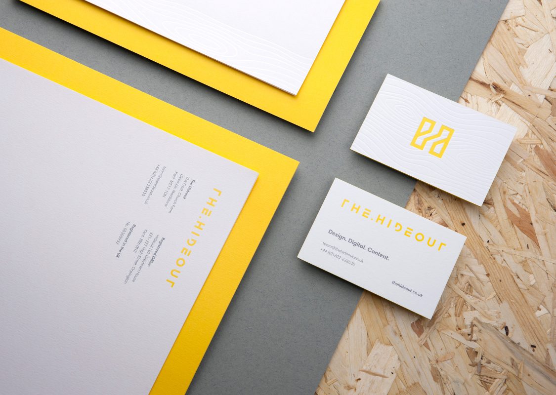
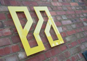
See the light, but don’t forget the dark

While the positive space, the things we immediately see, do take priority, the space between and around elements is arguably just as important. Usually these areas are seen as blank, however once we understand nothing is ever really empty, we can take advantage of it. 

Some of the most popular logos have been utilising negative space for years and are still just as contemporary as they were the first time round, so this is a route to consider when creating a logo where this is possible.
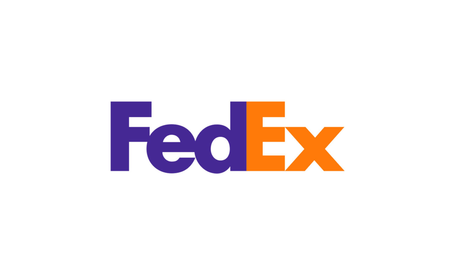
The Hideout
FedEx

The American multinational shipping & delivery company was founded in 1951 and is pretty well-known worldwide. Since 1994 the logo as we know it decorates all commercial marketing materials, from packaging to vehicle fleets. And if we look closer at it we can see why this was the chosen concept: Hidden in the space between the F E there is an arrow, cementing the idea of speed and forward movement that FedEx stands for.

The Hideout
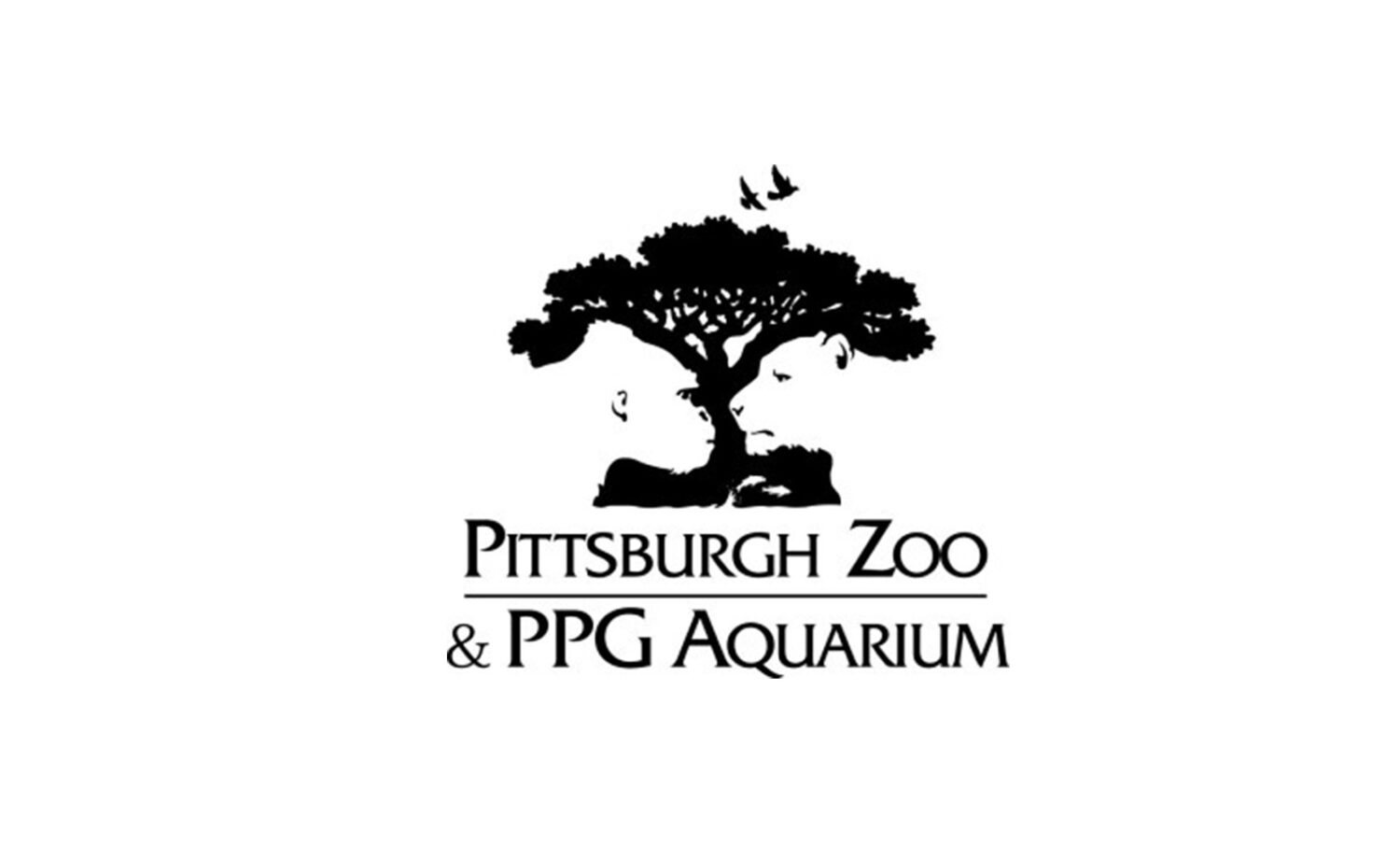
Pittsburgh Zoo & PPG Aquarium 

Opened in June 1898, Pittsburgh Zoo is one of only six major zoo and aquarium combinations in the United States. Stretching over 77 acres and housing over 4,000 animals, visitors stream into the zoo every year wanting to get a closer look at inhabitants. Their logo is a prime example of negative space. A large tree, depicting nature, is seen at first glance, but on closer inspection we can see a chimpanzee and a lion’s side profile, representing the animal kingdom.

The Hideout
Academy Awards

Ah, the Oscars. Who doesn’t like to watch the annual ceremony where a bunch of celebrities congratulate each other on the hard work they did earning millions. I’m just a bit jealous. Joking aside, the Academy Awards’ logo uses the simple shape of the A with a negative space of the iconic trophy to create the perfect harmony between typography and icon. Super simple, yet effective.

And how?

There are a few things to keep in mind if this is the route you want to go down for a project. Negative space is all about combining two (or more) elements to create one balanced picture that doesn’t shorten one message or the other. 

Most importantly you will need to watch out for contrast. Making sure both elements, while integrated with each other, are distinguishably separated. Otherwise you will end up with shapes that won’t make a lot of sense and you will lose the meaning you want to convey.

Another thing to keep in mind is the complexity of your shapes. Keep them simple, but full of impact. If, especially the positive shape, is too detailed, it will take away space to work with for the negative element, which in turn will make it very difficult to see the hidden aspect. Cutting parts out of the main body however, will create new components that will have a more organic flow. 

While negative space is a cool little tool, it’s also important to recognise that sometimes it’s not right for the project. It’s difficult to nail, but if done right it can really take a logo to the next level.

Some of our favourites

If you are interested in seeing some more work with negative space outside of the logo world, check these two artists out.  

Noma Bar, an Israeli graphic designer, is undoubtedly the king of negative space. Little stories are cleverly disguised in the form of simple shapes with high contrast. Love it!

Shigeo Fukuda, born in Tokyo, is known for his optical illusions and illustrations that take your mind on a little rollercoaster. Unfortunately, he passed away in 2009, yet his work is still a staple in the industry.