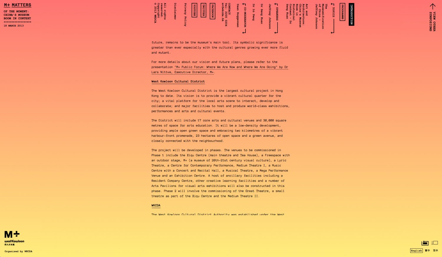
Brutal? As in violent?
In a sense, yes. While some of us might find the image to the left torture for our eyes, in reality there’s much more to it than throwing random elements on the page and hoping for the best. It’s a revolution against all the slick websites out there, against big hero images above the fold and generic inspirational blurb in a serif font on top.
Back to the roots
Who the hell came up with making websites look like they’ve been left unmaintained since the 90’s with no respect for carefully picked grids and thoughtful colour theories?
The answer is Pascal Deville, the Swiss guy behind freundlichegruesse.com. Him and his website brutalistwebsites.com, which he launched in 2014 went viral instantly and a new trend was born, which thousands of people take inspiration from. It started off purely as a web design trend which, besides the superficial look, also took the concept of Brutalism to heart in rough and imperfect, hand coded HTML. (Guess the inside doesn’t count much here either, huh?)
The basis for mainstream design
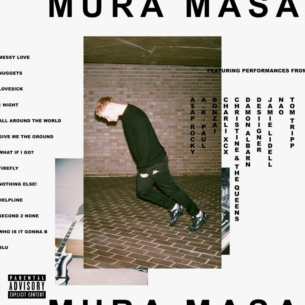
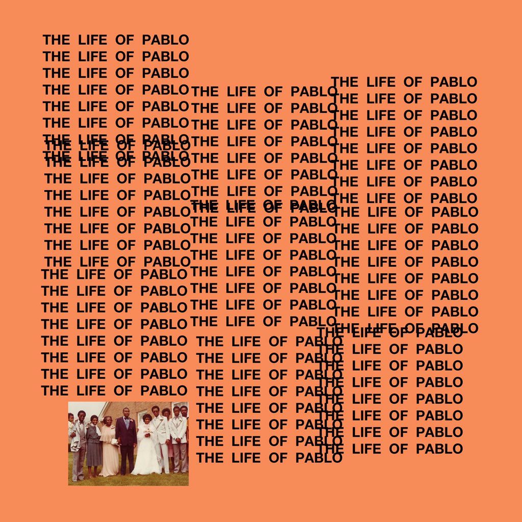
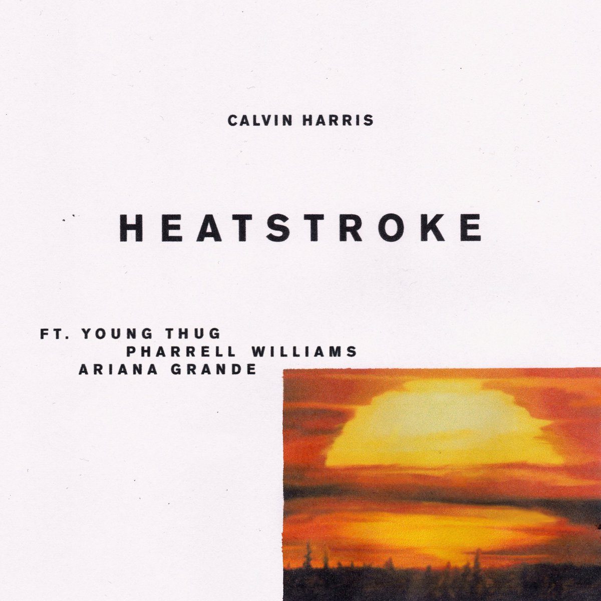
Having been around since 2014 Brutalism has proven itself to be quite the survivalist, so it’s no surprise that this style seems to be receiving another boost from the mainstream media. Big names like Calvin Harris, Mura Masa and Kanye West have designed their new album and singles covers to fit in-line.
Rather than seeing it as a destruction of design, it’s more about being brutally honest about the message they want to bring across. Unnecessary decorative details are being swapped for atypical compositions with no limitation of imagination, all while bringing the information needed right to the point. Without being boring and able to stand out in comparison to all the other expressive visuals out there, Brutalism takes a whole new spin on the minimalism trend that grew popular over the past years.